The Analysis of Scale Data
This article is a joint effort between the program-level assessment team and the student course survey team, forming the second part of a two-part series focusing on scale data. In this installment, we will delve into the analysis of rating scale data.

This article is a joint effort between the program-level assessment team and the student course survey team, forming the second part of a two-part series focusing on scale data. In this installment, we will delve into the analysis of rating scale data.
In the previous month's article, we covered the basics of scales, their purpose, and how they are utilized. Specifically, we distinguished between two common data collection methods frequently employed in surveys: Likert Scales and Likert-type items.
A Likert Scale is a multi-item psychometric assessment tool that measures a concept across a series of individual questions. The data collected from this tool is intended for collective analysis rather than individual item analysis. The aggregated score is the unit of analysis. It can be treated as continuous data and assessed using all measures of central tendency, mode, median, or mean. Additionally, the standard deviation can be calculated, and inferential statistics, like T-tests, can be utilized for comparing means between two groups, see Table 1. By contrast, the data collected from Likert-type items—individual items measured using various types of response scales—should be analyzed as separate items using sorting and grouping techniques like frequency distribution tables or visual aids like bar charts. Calculating means and averages is not appropriate for this data type, although data can be analyzed using median or mode, see Table 1.
|
Likert-type Data |
Likert Scale Data |
|
|---|---|---|
|
Central Tendency |
Median or Mode |
Mean |
|
Variability |
Frequencies |
Standard deviation |
|
Associations |
Kendall tau B or C |
Pearson’s r |
|
Other Statistics |
Chi-square |
ANOVA, t-test, regression |
What does this mean in practice?
For outcomes assessment, when a program collects indirect measure data through a survey, an appropriate target would relate to the frequency of a response, and the results should be reported as a frequency table or diagram.
For example:
Program learning outcome: Upon completing the program, students can synthesize and analyze information from a variety of sources.
Indirect measure: a graduation survey that asks students:
How confident are you in your ability to synthesize and analyze information from a variety of sources?
[Not Confident] - [Somewhat Confident] - [Confident] - [Very Confident]
Target: 90% of students report being confident in their ability to synthesize and analyze information from a variety of sources
Results:
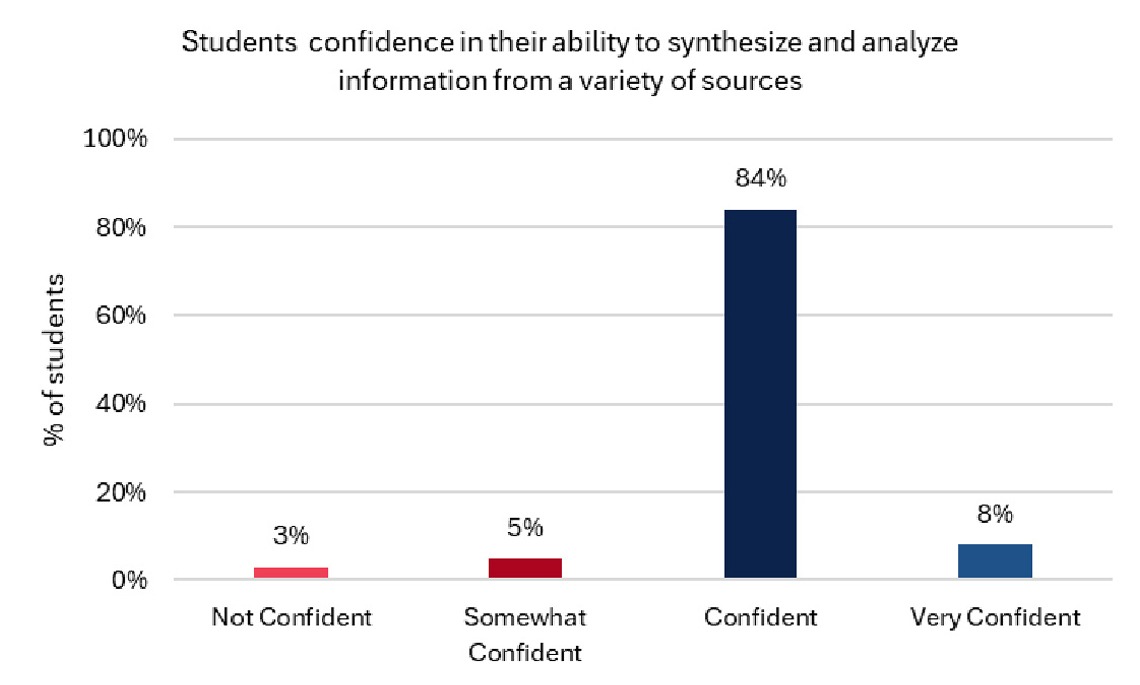
Analysis: It is not appropriate to assign numerical values to the response scale during the analysis phase and find that “on average, students are confident”; making inferences about individual students' expectations from program-level data is also not prudent. Instead, align the measurement approach with the analytical approach and discuss the findings.
When interpreting the results of scale data, it is important to consider the type of information and measures being presented. For Student Course Survey (SCS) data, the items ask students about their experiences in the classroom. The items target specific elements of teaching effectiveness and ask students to agree or disagree with the statements. The results should be interpreted based on trends in the data rather than based on individual responses.
For example:
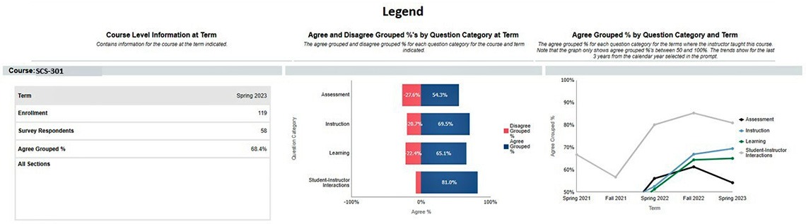
The items are grouped into 4 main categories of teaching effectiveness. General trends can be viewed in terms of the percentage of students who agreed with the items in the Agree and Disagree Grouped %'s by Question Category at Term graph and those who agreed across several semesters, as shown in the Agree Grouped % by Question Category and Term graph.
The Agree and Disagree Grouped %'s by Question and Category at Term graph indicates that most students agree with SCS items but show room for improvement in Assessment, Instruction, and Learning. The response frequencies for each item within those categories can help narrow down areas for improvement.
Viewing the upward trend in the Agree Grouped % by Question Category and Term graph, especially for Instruction and Learning, suggests new strategies have been implemented and teaching effectiveness is improving. This information should be correlated with classroom strategies to identify what is helping students learn and what areas need attention.
References
Boone Jr, H. N., & Boone, D. A. (2012). Analyzing Likert data. The Journal of Extension, 50(2), 48.
Harpe, S. E. (2015). How to analyze Likert and other rating scale data. Currents in pharmacy teaching and learning, 7(6), 836-850.